31 Days of Beans
A personal data visualization tracking our household bean consumption during COVID-19
Check out the live webpage
BRIEF
CONTEXT | A project for “Front-End Fundamentals” an intro class to html, css, and javascript at the University of Miami
ROLE | Designer and Coder
DATA COLLECTION TIMELINE | 1 Month
PROJECT TIMELINE | 3 Weeks
INSPIRATION | Dear Data
INSPIRATION
After working on data viz projects that explored important social issues from a researcher’s lens, I wanted to work on a data project that drew upon my own personal data. Inspired by Giorgia Lupi and Stephanie Posavec’s “Dear Data” project where they sent postcards to each other every week for one year documenting personal data they collected from their lives and represented through hand drawings, I recruited my housemates to do something similar.
OUR DATA
During 2020 and the peak of Covid-19 quarantine, my household took on a primarily vegetarian diet. Consequently, we cooked beans quite often and sometimes got creative in our dishes. I decided to ask my four housemates to document how many cans and what kinds of beans we ate in one month.
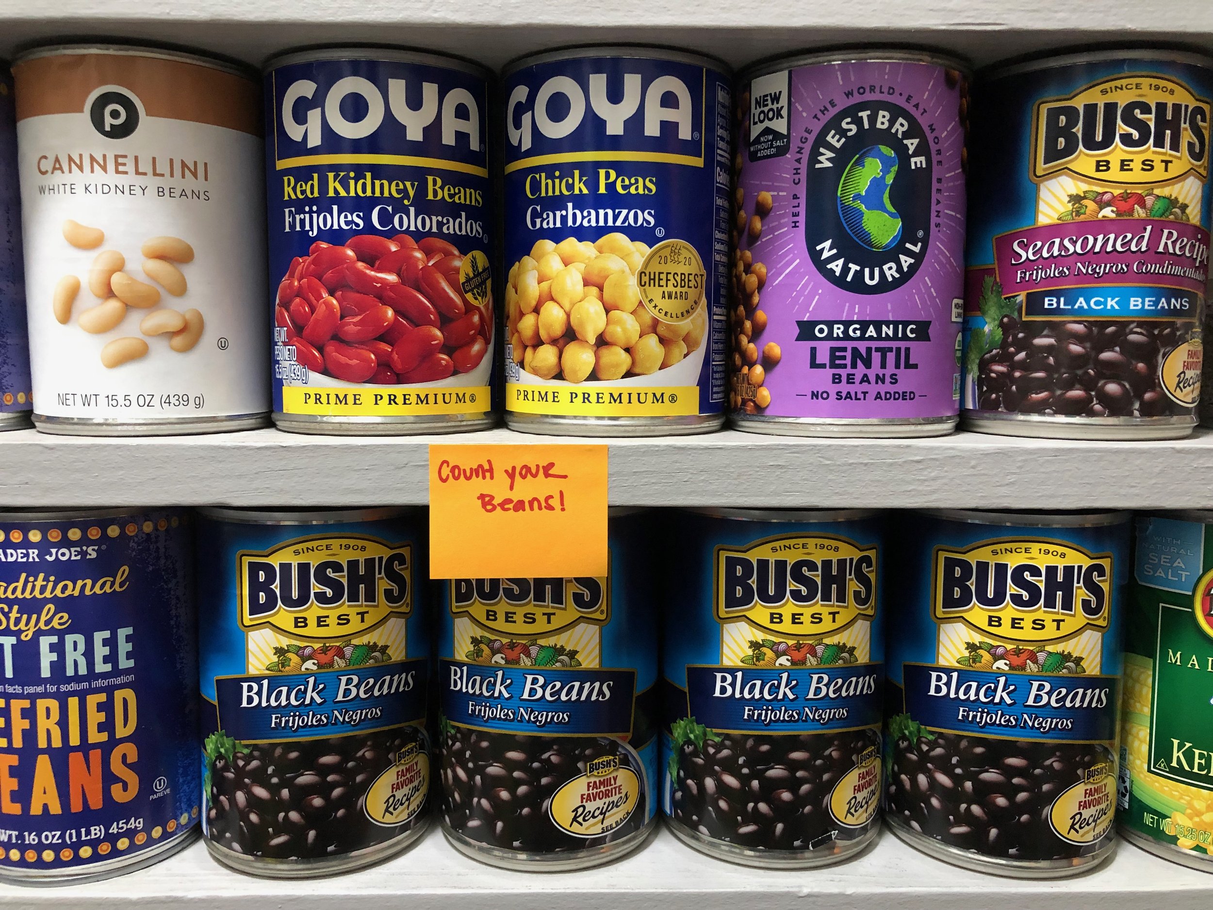
Our pantry, and a reminder to log the bean count.
The data we collected shows:
The number of cans of beans consumed in one month
The kinds of beans consumed
On which days the beans were consumed
The kinds of dishes made with the beans
Tallying up the count — we consumed 37 cans of beans in one month.
VISUAL STYLE
For this project, I really wanted to incorporate fun colors and illustrations I drew myself in Adobe Illustrator. I was inspired by the following projects:
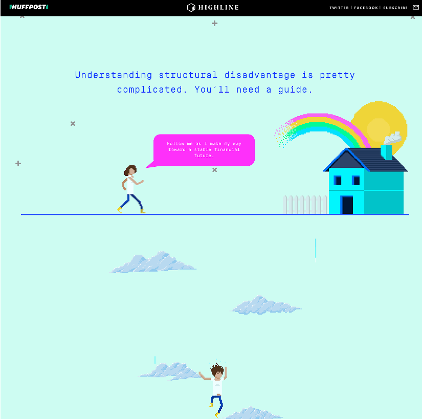
The first is a scrollytelling piece, “Millenials Are Screwed” from the Huffington Post that features arcade-like animations and pixel art.
The second is the hand-drawn data visualization project, Dear Data by Giorgia Lupi and Stephanie Posavec.
And the third, is pop art by Andy Warhol.
DESIGN & ILLUSTRATIONS
I had the idea for this project to look like a calendar month with each of the beans living in each square “day.” I thought this would be the easiest way to showcase how many cans of beans we ate in a day, what type of beans, and what day we ate them on.
For the illustrations of this project, I hand drew the beans and traced photos of the dishes while adding my own hand drawn elements. I wanted to use funky colors and evoke a pixelated style.
My dish image inspiration
Beans artboard in the works.
HTML & CSS
I first coded the website in Codepen, using HTML and CSS and featured hand drawn bean illustrations. I then transferred the files into Visual Studio Code and my GitHub repository. The viz is responsive to tablet and mobile sizes. However, it’s best viewed on desktop since this allows the viewer to see all 7 days of the week.
ADDING TOOLTIPS WITH JAVASCRIPT
In order to show illustrations of the dishes that we cooked, I wanted to add a tooltip feature that would allow the user to see the illustrations when they hovered over the respective blue text box that says the dish name. Because I wanted only the blue boxes to have a reaction when hovered over, I knew that this would need to use javascript. I found a few ways to do this:
Image mapping: An image with clickable areas. I would need to manually identify coordinates to create a shape that would cover the clickable area. I found the following resources on this:
An issue that I ran into with image mapping was that the website could not be responsive. Since the coordinates are set by pixel coordinates on the page, the clickable/hoverable shapes created on the image would not be responsive when the page size changes.
This led me to exporting my illustrations as SVG files right into the code to figure out if I could use the SVG code to identify my blue rectangles that I wanted to be able to hover over, add a class to them and use javascript to create a function that would allow X image to show up if X blue rectangle was hovered over.
With lots of help from my professor, we were able to create a successful function, however, soon realized that because I was exporting images from Adobe Illustrator, the class names of different elements on different SVGs were using the same names. This resulted in colors changing on the SVGs because only the most recent line of code that had X class name for X color would run.
We then tried to manually change class names for each of the SVGs but this proved extremely difficult and time consuming.
BACK TO HTML & CSS
At the rate that I was going, I realized that in order to have the blue rectangles “hoverable” I would have to code my pink squares in HTML using 4-6 divs inside the pink squares to hold the blue rectangles and the images of the beans. However, that would mean that the illustrations wouldn’t have a “random” hand drawn effect.
Ultimately I decided to make the original PNG images hoverable. For days with two dishes/two blue rectangles, I included the two dishes in one tooltip instead of executing my original idea of having separate tooltips. This proved to be the easiest solution.
Check it out the final webpage here.
REFLECTION
Think about the code as you design. This helped me to understand why it’s important for designers and developers to collaborate throughout the duration of a project. I illustrated this piece first without giving any thought as to how the development process would work. If I had more time to work on it, I would have been able to figure out how to create a grid within each pink square and input each of the elements while making the only specific divs hoverable. However, because my “design brain” didn’t talk to my “developer brain” at all during this process, I didn’t figure this out until much later.
Continuously explore illustration styles. While the beans illustrations were what I had envisioned, I felt that the final dish illustrations were not quite in line with what I had imagined. They were very detailed and not as whimsical and retro as I would have liked them to be. Here, I would have benefitted from doing more illustration and style research to get the dish illustrations to a place that matched the overall visual style of the piece better.


